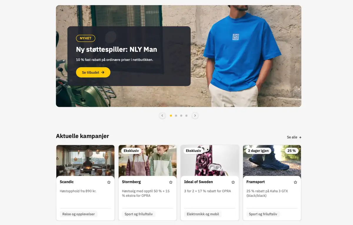
A simpler OPRA
Over the past months, the OPRA team has gone through both the app and opra.no from end to end. We have refreshed the design, tidied up the structure, and made a series of upgrades under the hood. The goal has been the same all along: to help you find what you need, when you need it.
What is new
A new design. The app and the website have a fresher, cleaner look, with stronger contrast and better readability.
Simpler navigation. We have reorganized the content so you get where you are going faster.
Better search. Finding your way around should be easy, whether you know exactly what you are looking for or just want to browse.
A faster experience. Pages load quicker, and the app feels more responsive.
We want to hear from you
The redesign is a starting point, not a finish line. Now we are curious about what you think. What works well? What feels clumsy? Is there anything you are missing?
Send us your feedback and the team will take it into the next round of work. Your input is the most valuable thing we have when making OPRA even better.